


SaŌrii — Brand Identity
Brand identity by Sigil Advertising
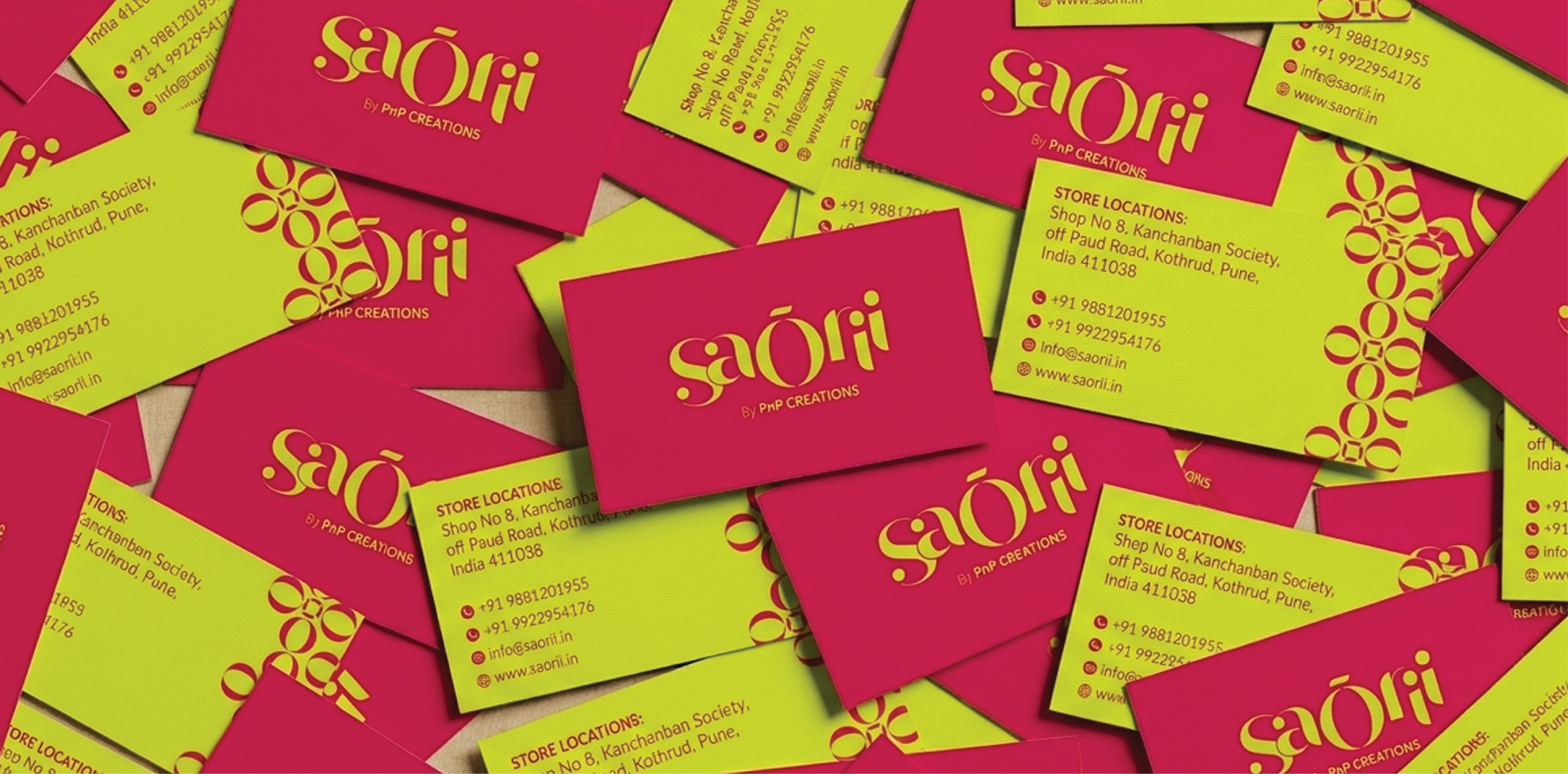
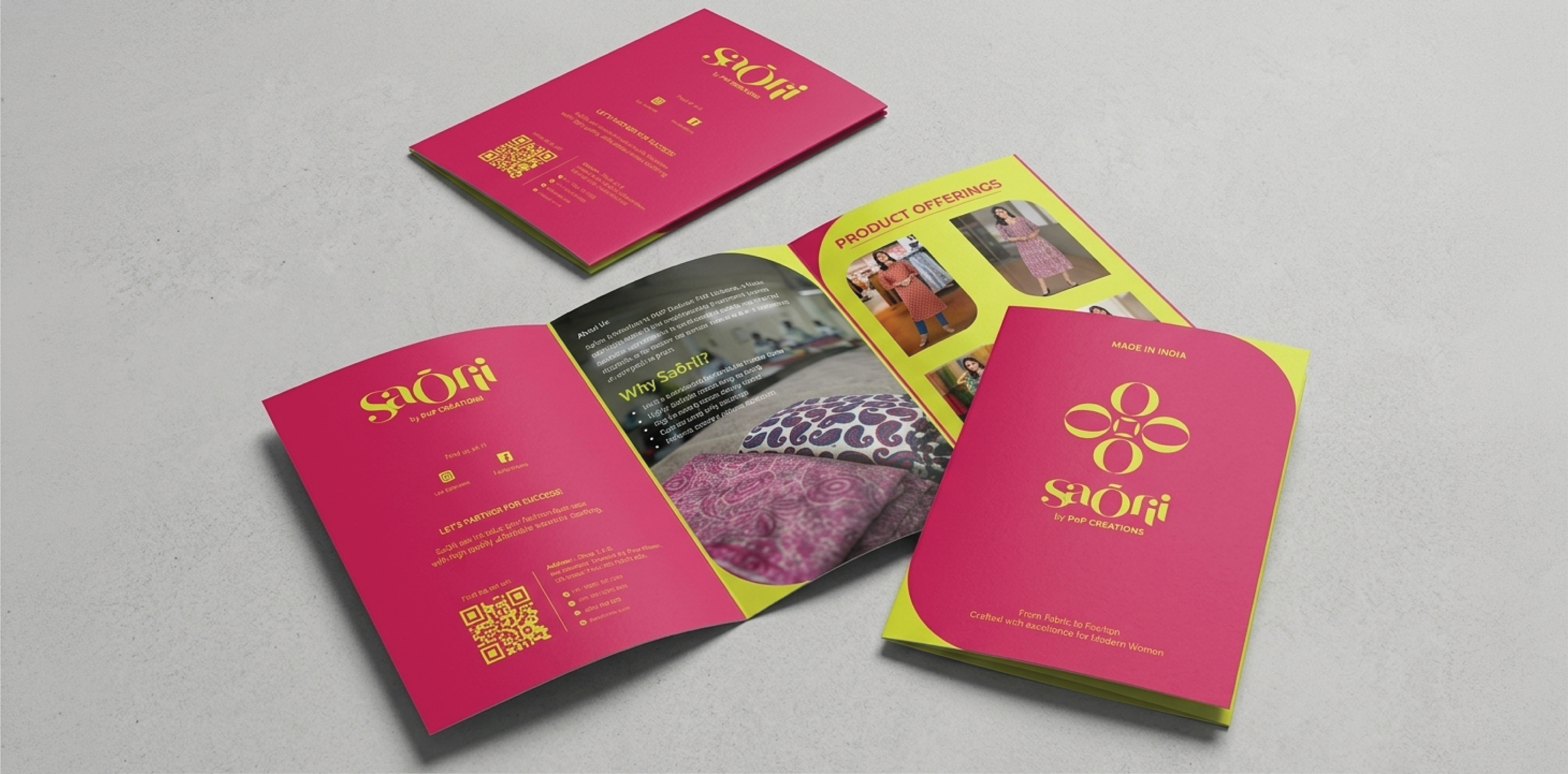
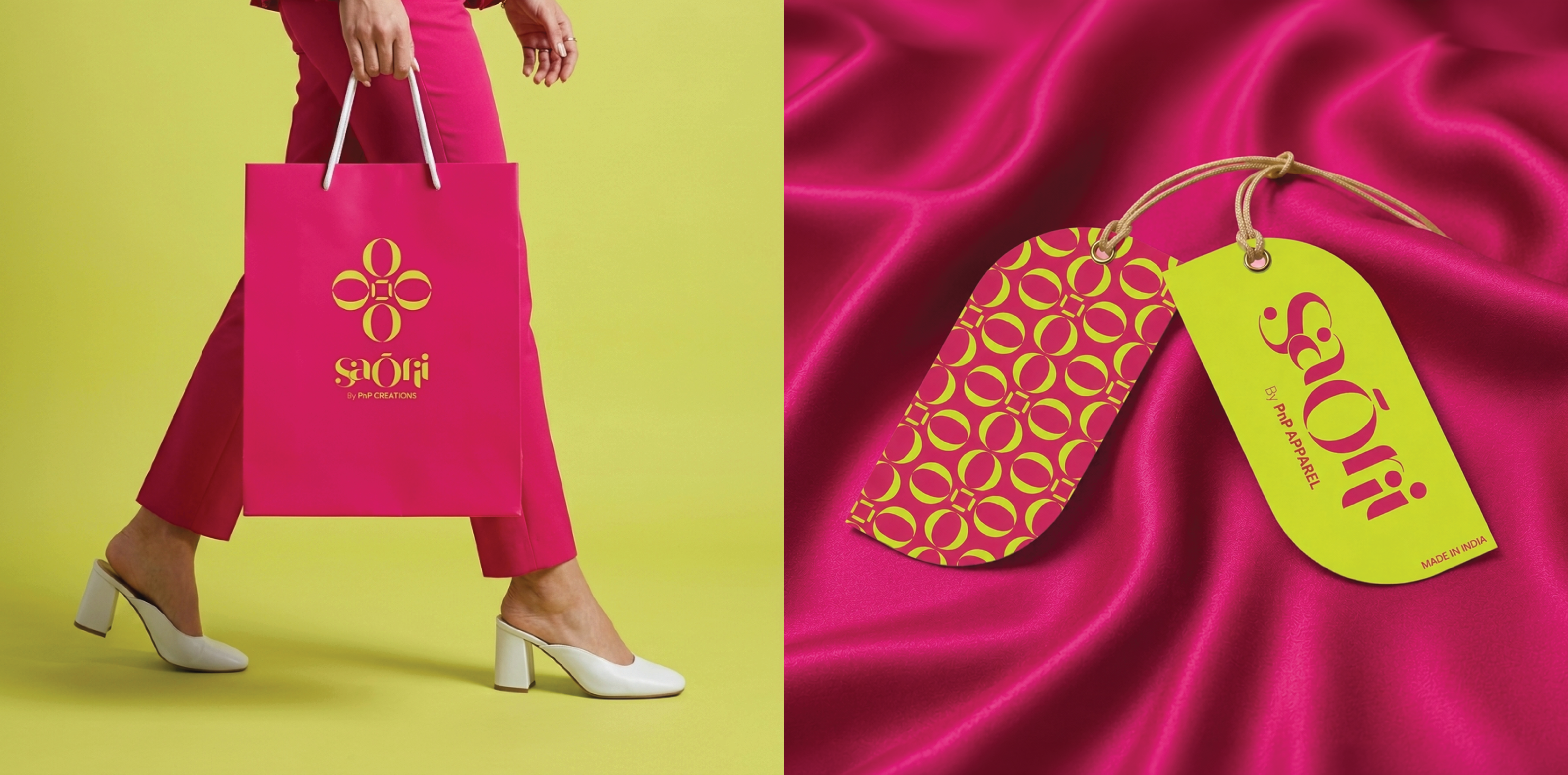
SaŌrii is a women's clothing label by PnP Creations Pvt. Ltd. — a brand built from the ground up, beginning with the name itself. Sigil Advertising was brought in at the earliest stage, contributing to the naming process before designing a complete visual identity system. The brief was clear: build an identity that is modern, graceful, and unmistakably Indian — ready to launch across product tags, packaging, digital, and retail.
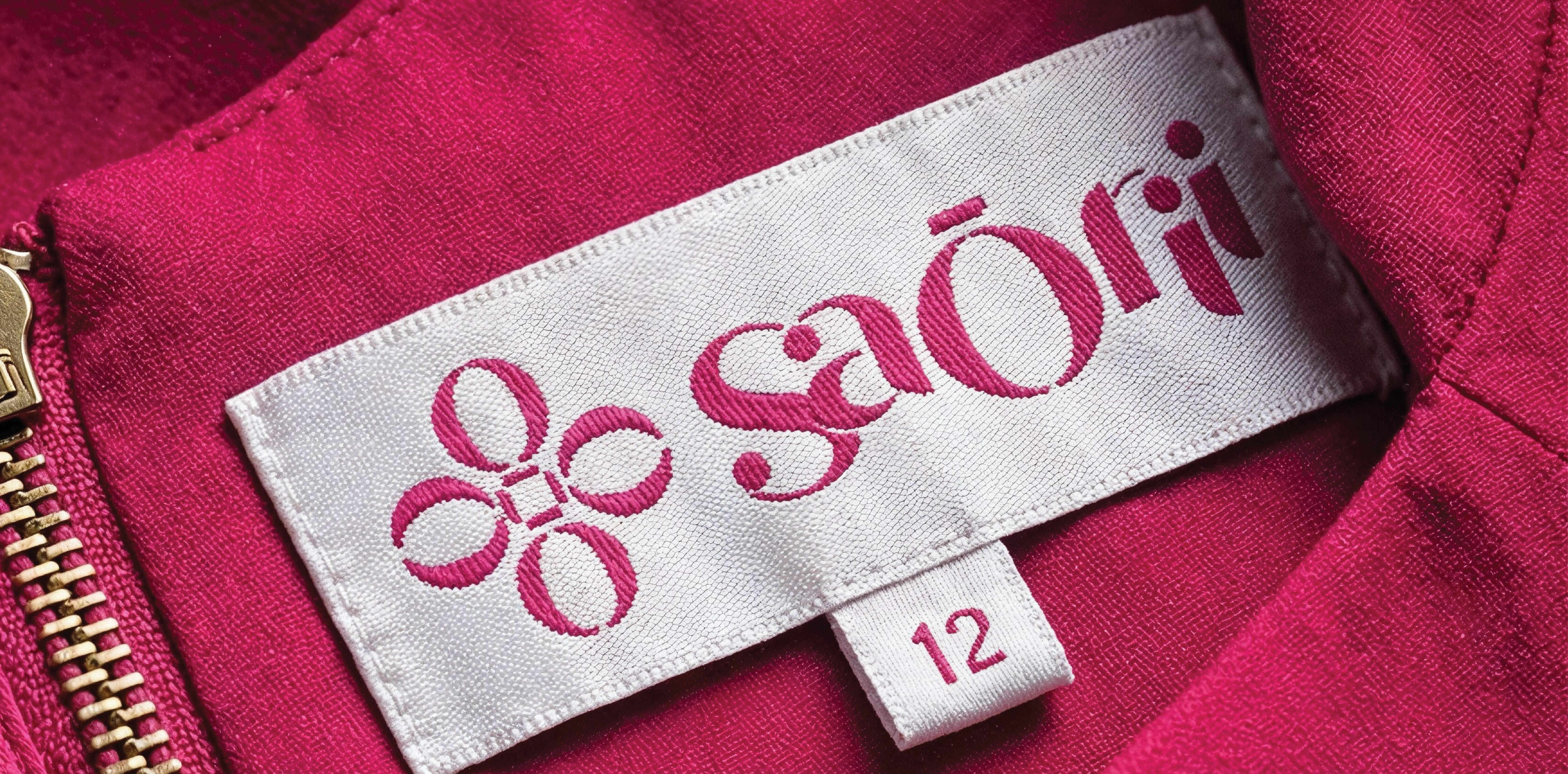
From naming to launch — a brand built from the ground up.
A fashion brand's identity must communicate at two levels simultaneously — premium and modern at a glance, while carrying a deeper cultural resonance that makes it distinctly Indian. The SaŌrii mark was designed to move: the forms suggest flow, drape, and the graceful motion of fabric, while remaining clean enough to work at every scale. Every decision — letter-spacing, weight contrast, colour temperature — was made to position the brand confidently in the premium segment without alienating the contemporary Indian consumer. From naming to logo, every element speaks the same visual language.
- Brand naming input and shortlisting
- Logo design — primary mark, wordmark, and usage variants
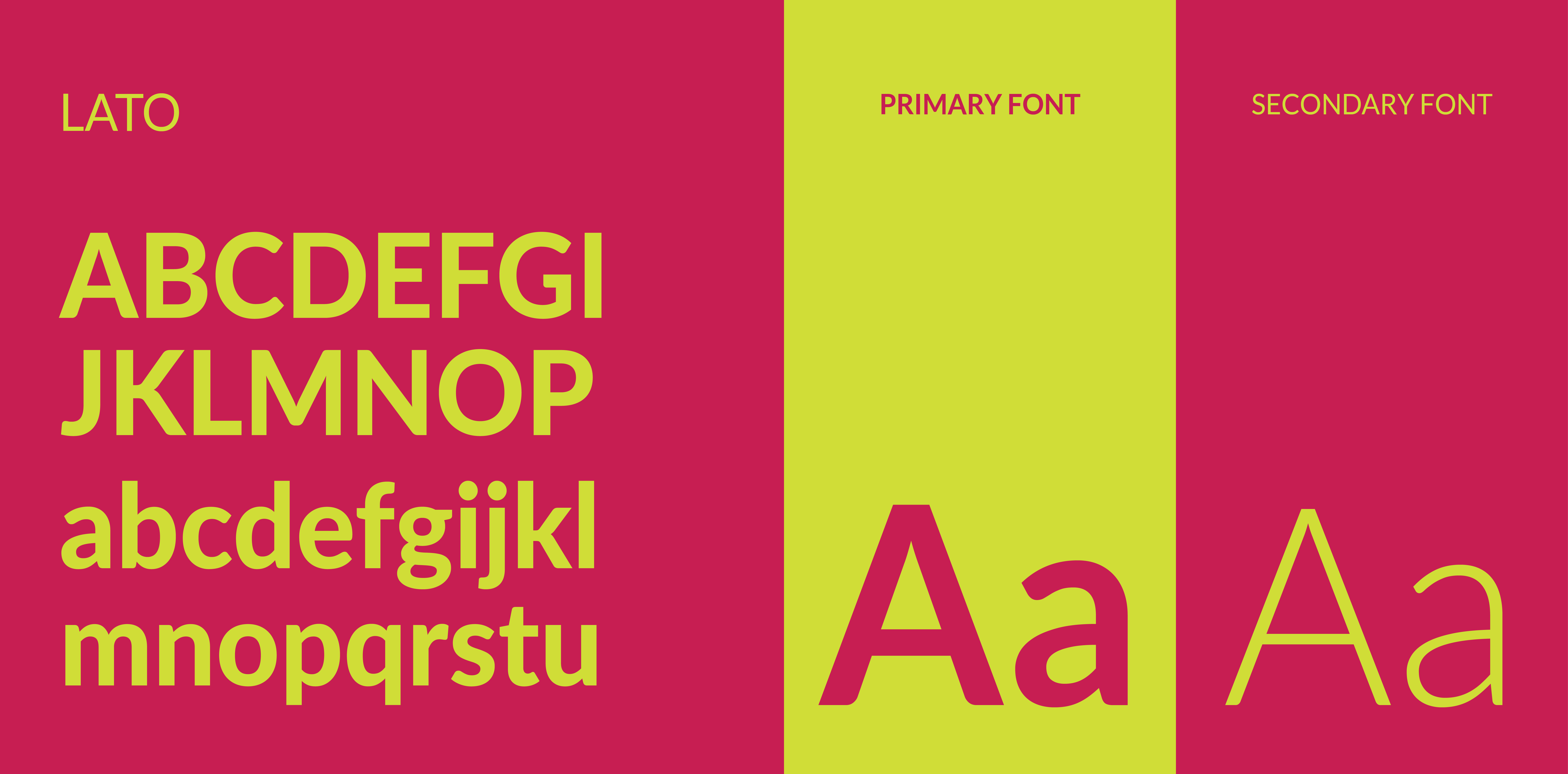
- Visual identity system — colours, typography, and graphic language
- Brand colour palette and typography system for print and digital
- Brand usage guidelines delivered for launch
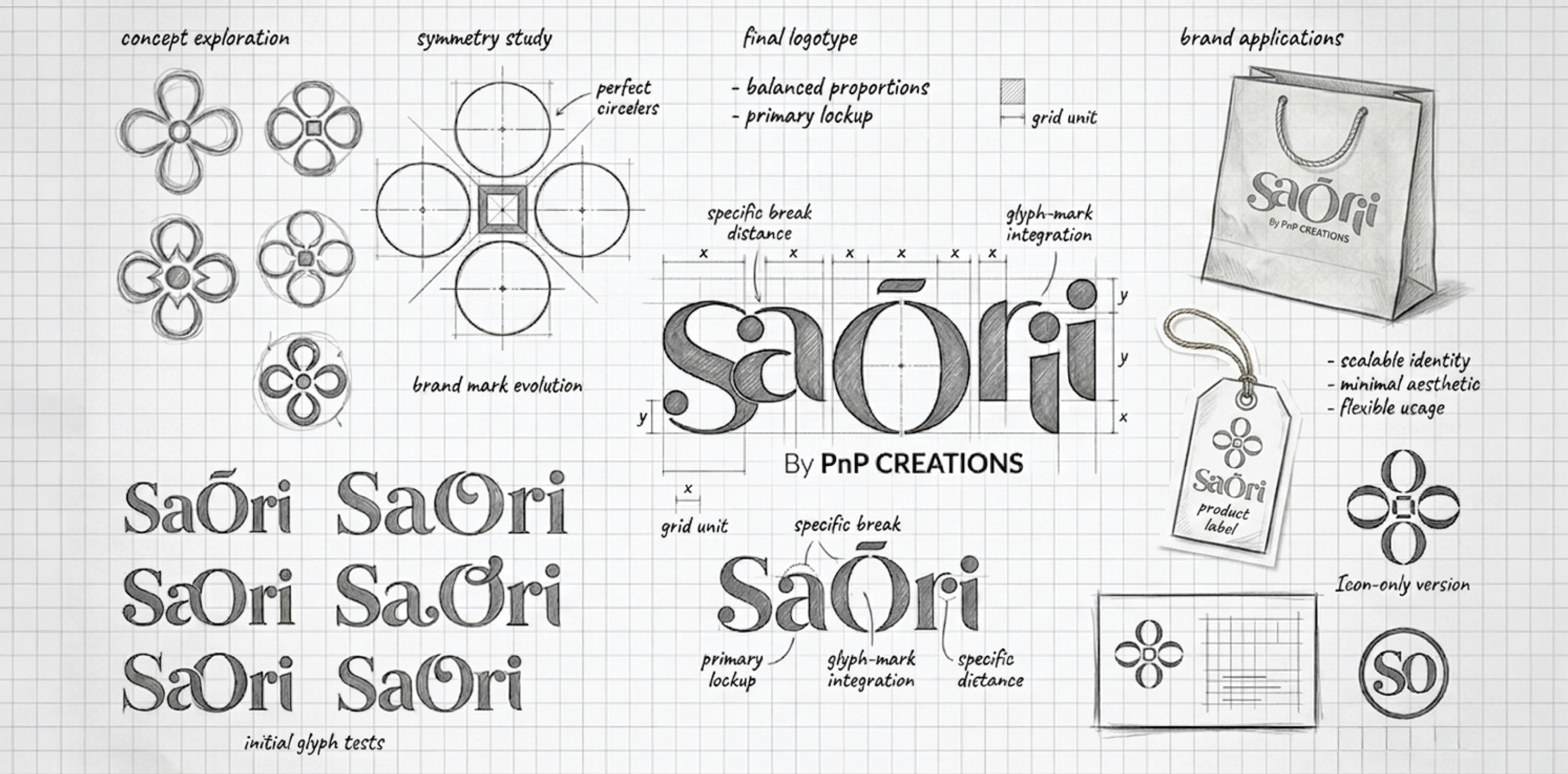
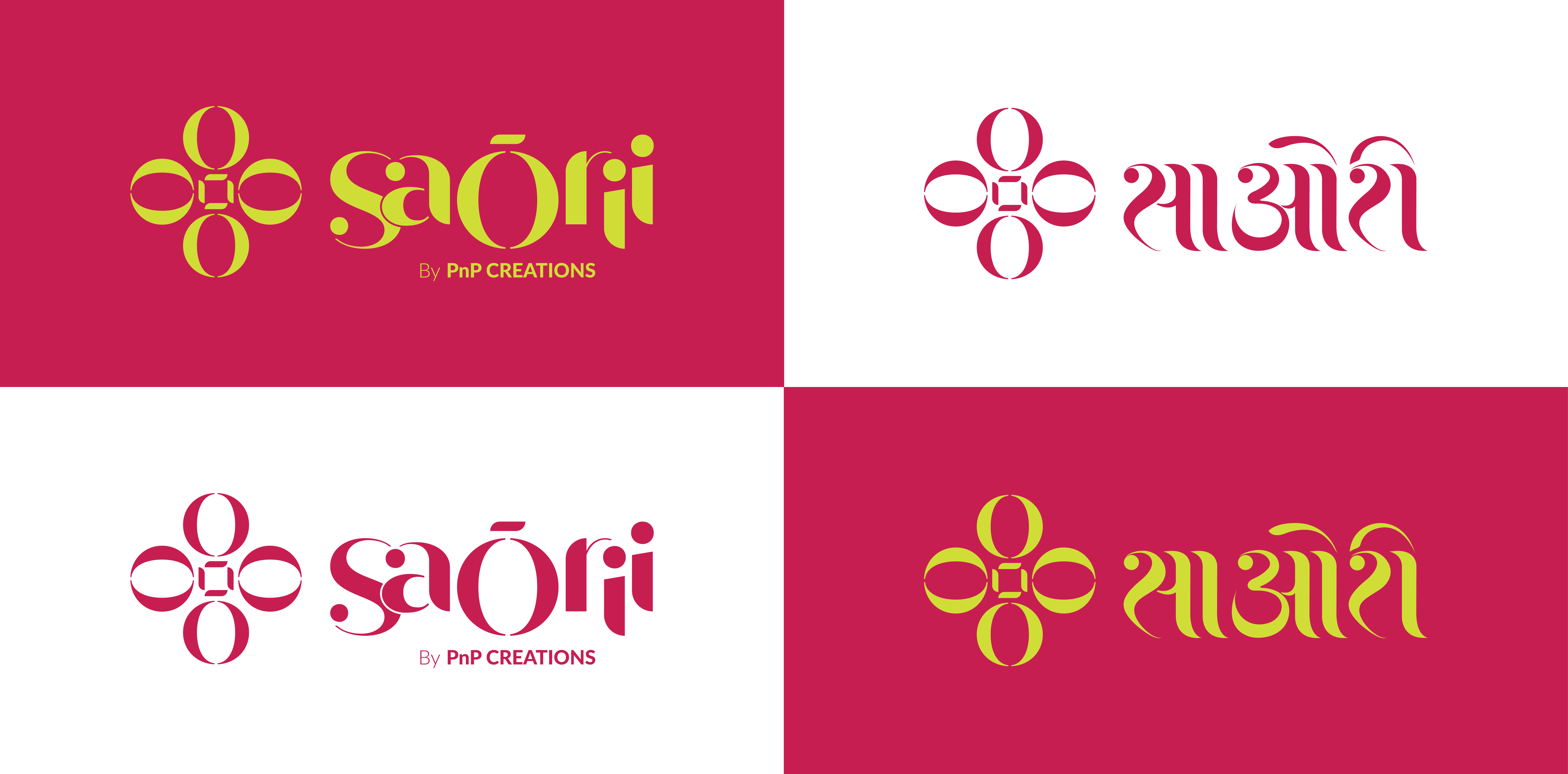
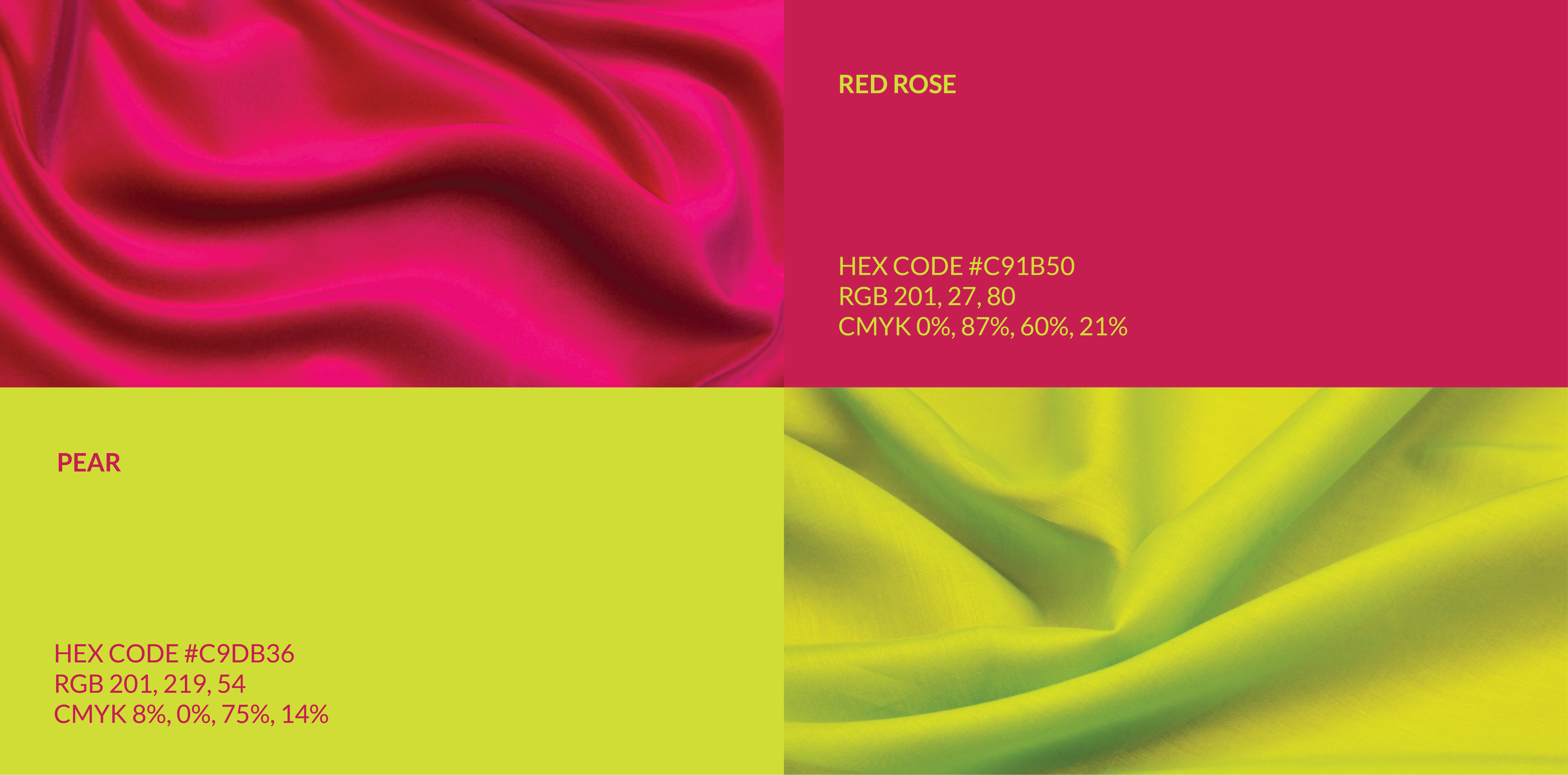
Moves like silk.
PnP Creations Pvt. Ltd.
Founders, SaŌrii
Sigil created a full brand identity for our label — starting from the name and ending with a logo that moves like silk.
Start your project Start your project